Description
LucasFonts is the company of Dutch type designer Luc(as) de Groot. Besides retail fonts LucasFonts offers every possible kind of service, adapting fonts to your needs and designing customized glyphs or complete typefaces at http://lucasfonts.com Luc(as) de Groot is one of the best known type designers of his generation. His fame was grounded with his large font family Thesis: TheSans, TheSerif, TheMix, TheSansMono and TheAntiqua. He designed Corpid, JesusLovesYouAll and custom fonts for magazines such as TAZ for die tageszeitung and SpiegelSans for Der Spiegel in Germany, FolhaSerif for the Brazilian newspaper Folha de S.Paulo, plus others for Le Monde, Metro, and German TV station ARD. He created corporate type for international companies including Sun Microsystems, Bell South, Heineken, Volkswagen and Miele. For Microsoft, Luc(as) designed the monospaced font family Consolas, and Calibri, the new standard typeface in Microsoft Word.
Luc(as) de Groot is a web font and hinting specialist and developed a theory of interpolation. He teaches at the University of Applied Sciences in Potsdam, Germany, and gives lectures at type conferences worlwide.
Tell your friends
RECENT FACEBOOK POSTS
facebook.comJob opportunity in Berlin: We are looking for a full-time type designer with FontLab and German skills. Contact: work@lucasfonts.com
It’s going to be a looong night! Luc(as)’s students from FH Potsdam are at work in our office, putting the final touches on their assignments which are due tomorrow. But there are final versions and then there are final final versions … 😉
Long live LF Koning! Koning is Dutch for king. A king that represents elegance and prestige while being grounded to its people – just like this typeface. The creation of Koning dates back to May 2004. It started as a contrast axis for the Corpid family, but we will not reveal the whole story yet. Over the years our font soon-to-be-known-as Koning emerged into something very special, or rather, into two directions: one optimized for text and one for display sizes. Each part is made to work best on their jobs. The display style, not too fancy, offers eye-pleasing details for extra attention, at the same time requiring minimum space; the text style is more down to earth, but still graceful. The Koning Text family comprises eight weights from Light to Black in roman and italic while Koning Display has additional UltraLight and ExtraLight weights. So far it speaks every central European language. Letters for Greek and Cyrillic-based languages are being worked on while you are reading this. Koning provides pretty much all kinds of figures: hanging, lining and even in small cap size, all in proportional and tabular variants. It serves your typographical needs with small caps (in Koning Text), standard and discretionary ligatures, smart contextual replacements, a full range of superiors, inferiors, nominators, denominators, case sensitive punctuation and two sets of fractions, two sets of arrows, stylistic alternatives… LF Koning will be officially released on September 9th (latest) and can be pre-ordered now. Please contact us at LucasFonts.com – be among the first to salute the new king. Koning just received the 2018 Communication Arts Award of Excellence. https://www.commarts.com/
Since last week Luc(as) is giving a type design workshop in the village of Bozhentsi with 16 lovely, dedicated people, mostly from Bulgaria, one from Russia and one from Germany. The wonderful pictures are made by participant Mihail Zhelyazkov – thank you, Mihail! For more information please see: https://www.facebook.com/notes/typofest/eye-opener-in-type-design/533142350189686/
Since last week Luc(as) is giving a type design workshop in the village of Bozhentsi with 16 lovely, dedicated people, mostly from Bulgaria, one from Russia and one from Germany. The wonderful pictures are made by participant Mihail Zhelyazkov – thank you, Mihail! For more information please see: https://www.facebook.com/notes/typofest/eye-opener-in-type-design/533142350189686/
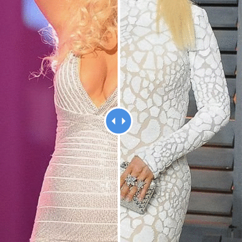
Our phones kept ringing today as journalists from all over the world inquired about the history of Calibri. Calibri, the default font in Microsoft Office, is currently an important ‘witness’ in a Pakistan investigation into a document counterfeiting case. https://propakistani.pk/2017/07/11/font-fail-calibri-font-prove-turning-point-jits-investigation/ Not everybody trusted the Wikipedia page: https://propakistani.pk/2017/07/11/fontfail-pakistanis-now-modifying-calibri-fonts-wikipedia-page/ ;)
Happy and honoured to host Typostammtisch Berlin tonight. https://typostammtisch.berlin/05-04-17-david-brezina
After some 5 years at LucasFonts, Aleksandra Samuļenkova is moving back to the Netherlands to live with her partner Just in Haarlem. (Yes, that Just, befriended with Lucas since somewhere in the eighties.) Luckily she left us with the remembrance of many happy days together – and a big fat Schwarzwälder Kirschtorte (which we finished within half an hour). Bye-bye, Aleksandra! Thanks for everything and all the best to you.
Yes we still are on duty these days, casting letters. (Some Dutch Sinterklaas traditions shimmering through.)
Quiz